
Kyu Matcha
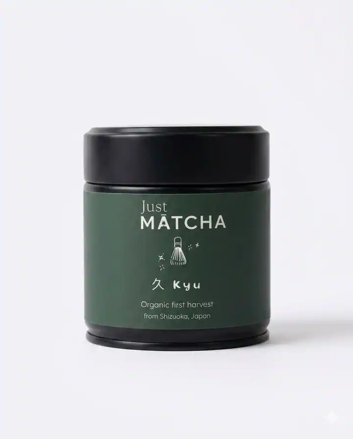
A matcha jar reference developed into a tactile visual system using ingredient storytelling, rich green tones, and sculptural range compositions.
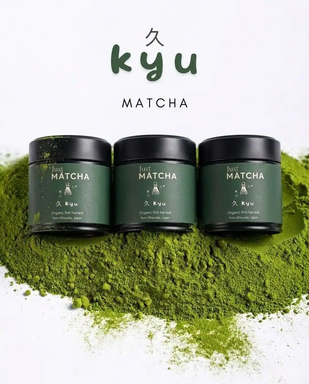
The challenge
What the visual system needed to solve.
Turn a straightforward packaging reference into a premium world that could stretch across launch, social, and ecommerce content.
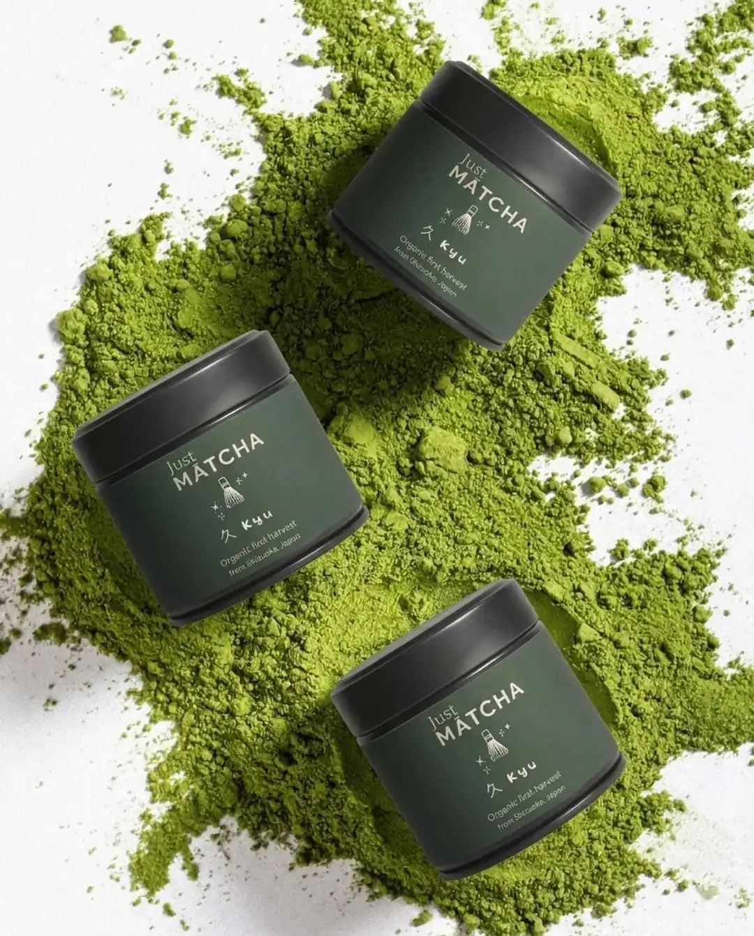
Creative direction: Dense matcha color, powdered texture, soft natural light, and compositions that make the product feel crafted rather than clinical.
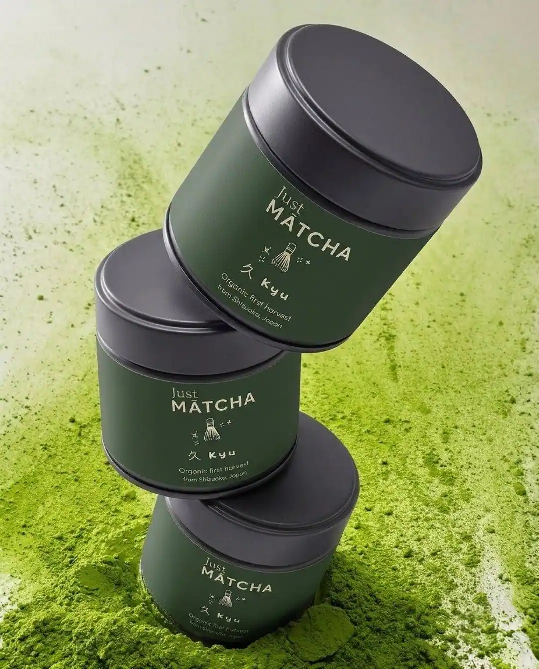
Deliverables: Range image, ingredient scene, stacked composition, hero direction, and channel-ready crops.
Outcome or usage note: Concept study demonstrating a launch-ready visual language for product pages, email heroes, and paid social tests.
Creative context
From a jar reference to channel-ready images.
A food or beverage campaign needs more than one attractive hero. The product must remain recognizable when the composition changes from a close-up ingredient scene to a wider launch banner. In this concept, the green palette and tactile powder treatment connect otherwise different crops.
An ecommerce version would prioritize label readability and realistic pack proportions. A social variant could push texture and art direction further, provided the product itself remains faithful to the reference. These are proposed production uses for an independent concept study, not verified deployment or performance claims.
Ready to improve your visuals?