
Rapid Repair
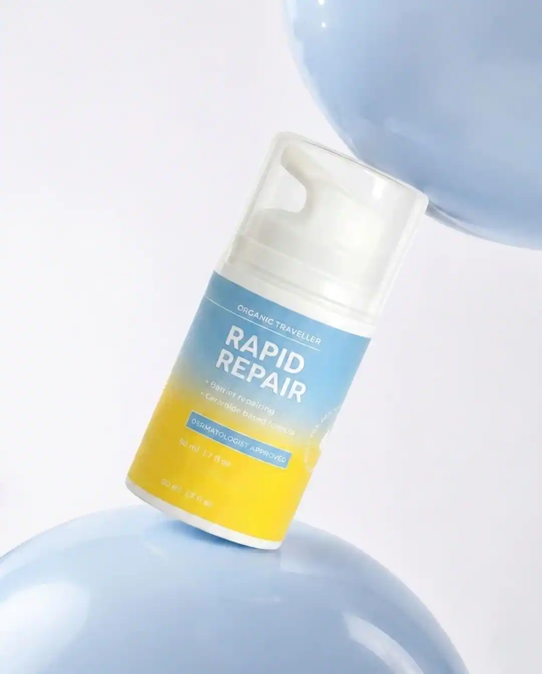
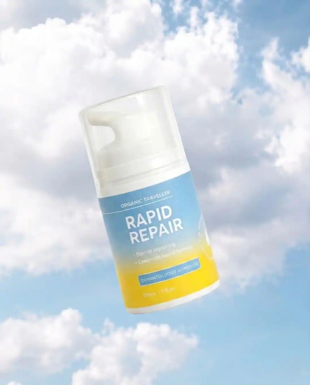
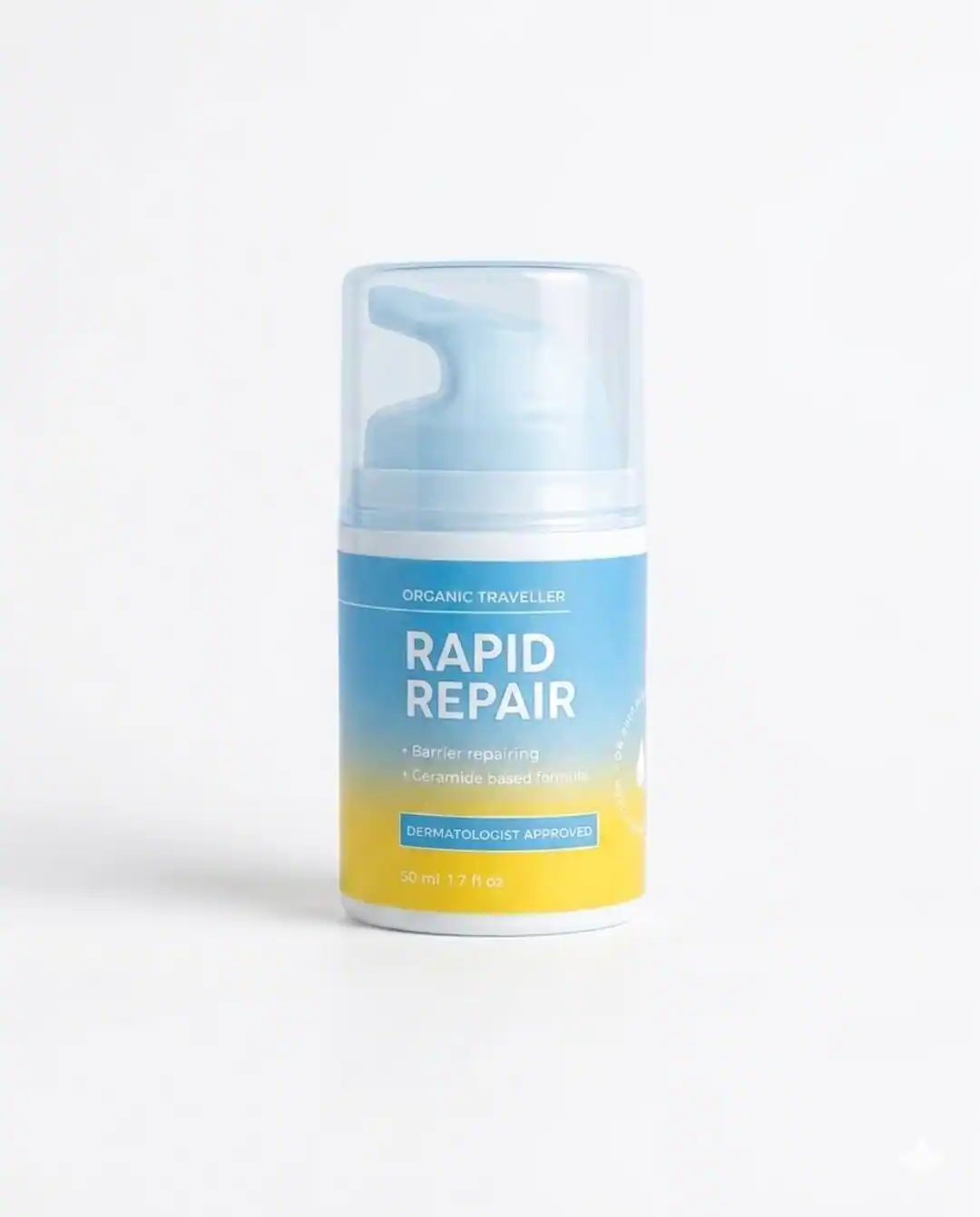
A repair-treatment reference developed into a colorful campaign set spanning water, sky, and high-contrast product-first scenes.
The challenge
What the visual system needed to solve.
Create a visual system that could make a functional beauty product feel bright, tactile, and campaign-ready without losing product clarity.
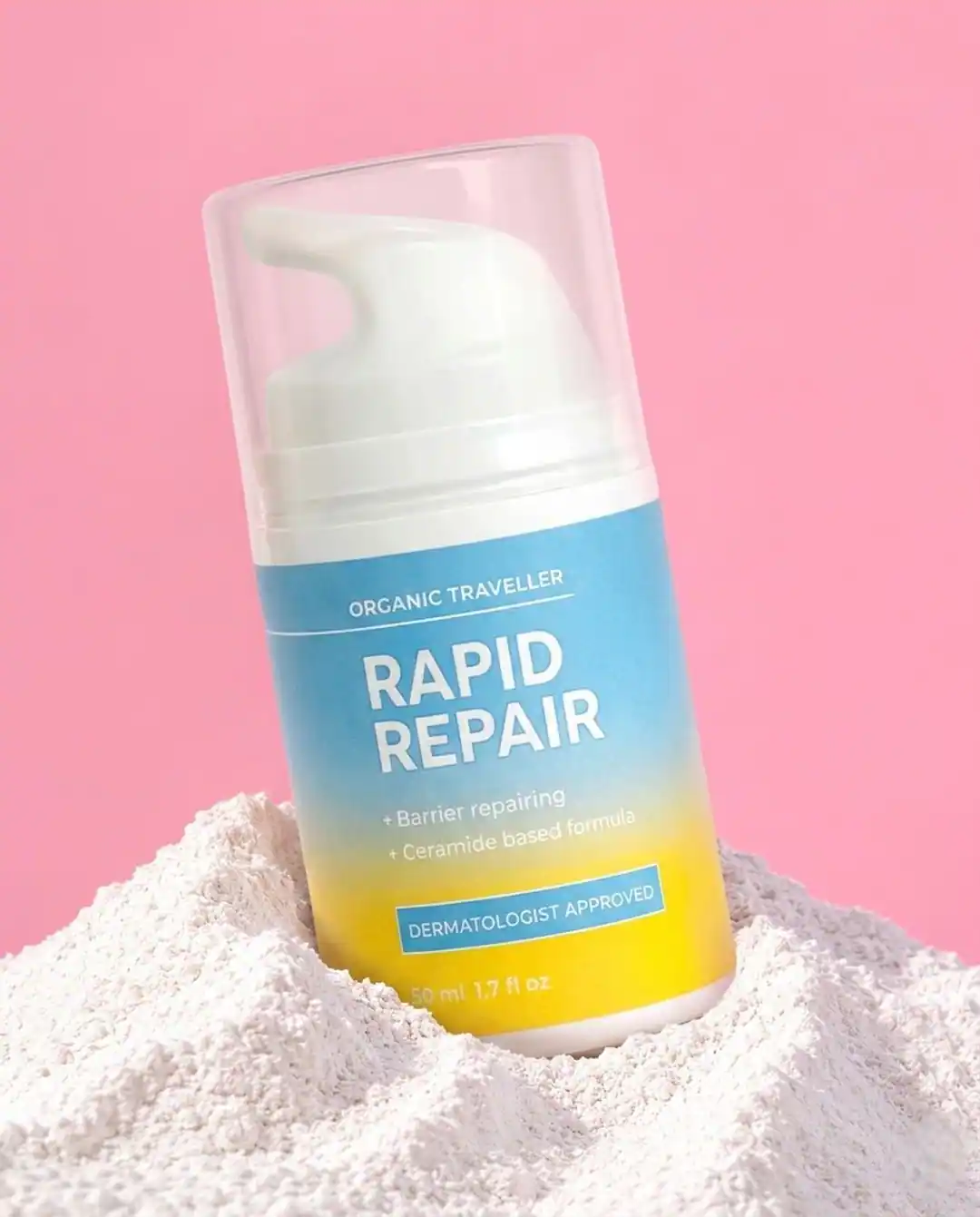
Creative direction: Clean product silhouettes, saturated backgrounds, reflective surfaces, and color-coded compositions for social and product pages.
Deliverables: Three campaign scenes, product-first compositions, and square/social-ready crops.
Outcome or usage note: Concept study showing how one SKU can support multiple ad angles while staying visually consistent.
Creative context
One product, several creative testing angles.
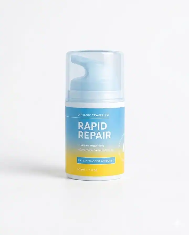
The visual study deliberately separates a functional product story from a single background treatment. Water, sky and saturated color create different moods, while the pack stays the organizing element. This makes it easier to compare creative directions before committing to a full campaign.
For a practical rollout, a product-page image would favor a more informative view, while social and paid placements might use the brighter scenes to earn attention. Each crop would still require a label and color review. The examples are concept artwork rather than evidence of a live client campaign.
Ready to improve your visuals?