Most of the conversation about AI product photography focuses on the generation — the prompt, the model, the moment the image lands in front of you. Almost no one talks about what happens after that, which is unfortunate, because retouching is where finished, sellable imagery actually gets made. The raw output of even the best generator is rarely the file you want sitting on a product page. It's a strong draft. The work of turning a draft into a hero shot is post-production.
I've been retouching commercial imagery for over a decade, the last few years almost exclusively on AI-generated work. The techniques below are what we use day-to-day in our studio. They're not all of post-processing — that's a career, not a blog post — but they cover the moves that most reliably take an AI output from "okay" to "you wouldn't know it was AI."
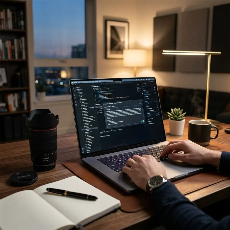
Human-led visual production
Want a visual system built around your product?
Share your brand, product references, and launch goals. We will recommend the right engagement model.
What an AI image actually needs
If you look at a hundred AI outputs from a current-generation model, you'll notice a small set of recurring weaknesses. Knowing what to look for is most of the battle.
- Slightly flat colour. Modern generators produce safe, evenly-lit colour. Real photography has more drama in its tonal distribution — slightly deeper shadows, slightly hotter highlights. Adding that back is usually the single biggest "this looks photographed, not generated" lever.
- Compressed contrast. Related but distinct: AI outputs often live in the middle of the histogram, with neither real blacks nor real whites. A small contrast lift restores depth.
- Edge confusion. Where the product meets the background, you'll occasionally see a soft fringe or a slight mismatch in focus. Easily fixed; easily ignored.
- Texture drift on small details. Fabric weave, leather grain, fine engraving — these often come through as a smoothed approximation rather than the real texture. Selective sharpening and texture work brings them back.
- Surface anomalies. Mis-shaped reflections, the occasional impossible shadow, a label that doesn't quite read. Quick cleanup with a clone or healing tool, nothing more.
What we actually use
Tooling is less interesting than people make it. The work matters more than the software. That said, in case it's useful:
- Lightroom Classic for the global pass — exposure, contrast, white balance, colour calibration, batch sync across a delivery set.
- Photoshop for anything local — cleanup, masked sharpening, frequency separation when a product surface needs it, occasional compositing.
- Capture One if the brand is colour-sensitive and we need precise hue control over specific bands of the spectrum. Stronger HSL toolkit than Lightroom.
- Topaz Photo AI for upscaling when a final deliverable needs to be larger than the generator's native output without losing edge detail.
For brands doing this in-house, Affinity Photo and the GIMP both cover most of what Photoshop does, at a fraction of the cost. The expensive tool is rarely what separates good work from mediocre work.
The global pass
The first set of adjustments should be the ones that apply equally to every image in the batch. Working globally first means you're not relighting the entire image after you've spent twenty minutes retouching a label.
Start with white balance. AI outputs often have a slight warm or cool cast that's invisible in isolation and obvious across a catalogue. Pick a neutral surface in the image — a piece of white packaging, a grey shelf, the inside of a paper bag — and use it as your reference. If there isn't one, calibrate against another image in the same shoot where there is.
Then exposure and tone. Lift the shadows fractionally if the image is crushed, pull the highlights down if they're flat. Adjust the black point until the deepest shadow in the image actually reads as black; do the same with the white point. The histogram should fill the box without clipping at either end.
Contrast last. A small midtone contrast boost — clarity around +10, structure or texture around +8 — restores depth without making the image look obviously processed. Resist the urge to push these sliders to their limits; the moment a product image looks "edited," it loses credibility.
Colour grading without overcooking it
Brand colour grading is where you make a catalogue look like it came from one studio rather than a feed of separate generations. The trick is restraint. Even a faint warm-shadow / cool-highlight split sells consistency across an entire batch — and across an entire season — without anyone consciously noticing.
Use HSL on individual hue bands to control products whose colour is part of the brand identity. If your packaging is a specific dusty green and the generator is rendering it slightly more emerald than reality, pull saturation and adjust hue on the greens until it matches a physical sample. Do this once, save it as a calibration profile, apply across the batch.
Avoid LUTs unless you know exactly what they're doing. They're popular because they produce an immediate, dramatic shift, but they tend to baseline everyone's work to the same Instagram-y look — which is the opposite of brand differentiation. Build your own grade.
Sharpening, the right way
Most over-sharpened product photography is the result of someone moving the global sharpening slider until everything looks crisper. That isn't sharpening — it's just edge-noise amplification.
What actually works: a light global sharpening pass (Unsharp Mask, Amount around 80, Radius 1.0 to 1.2), followed by local sharpening on the areas that matter — the label, the texture of the fabric, the rim of the bottle. Mask out smooth areas where sharpening adds nothing but noise. For high-resolution deliverables, High Pass sharpening at a small radius (around 1.5 pixels) on a soft-light layer gives you cleaner edges than the global slider can.
Halos around the product edge — that telltale outline of brightness where the product meets the background — mean you've gone too far. Pull back.
Cleanup work
For most product images, the cleanup pass is the longest single step. Look closely at the parts of the image a buyer would scrutinise: the label, the closure, the seam, the brand mark, any text. AI generators are reliably weak on small text and reliably good at the rest of the image, which means a single mis-rendered character on an otherwise perfect bottle can undermine the whole shot.
Clone in correct lettering from your reference photo or, for serial work, replace the label entirely as a composited layer. For fabric where the weave has gone soft, sample a small patch of well-resolved texture from the same image and clone it in selectively. For unwanted reflections — common on glass and metal — paint the reflection out with a soft, dark brush on a low-opacity layer, then add it back where it should be using a custom highlight.
The principle is the same throughout: invisible. If the viewer notices the retouching, you've over-done it.
Category-specific retouching
Apparel
The main work is in restoring fabric texture. AI outputs tend to smooth the weave of natural fibres — linen, raw cotton, tweed — into something synthetic-looking. Selective texture enhancement on the fabric, plus a small clarity lift on the seams, brings the material back to life. For complex weaves (herringbone, houndstooth), be careful with sharpening; over-doing it makes the pattern look digital.
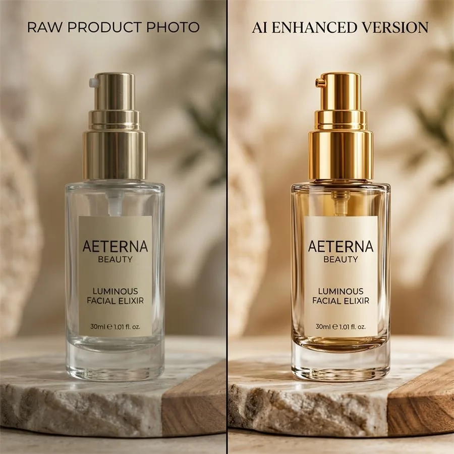
Skincare and beauty
Bottles, droppers, and glass are where AI output most reliably needs cleanup. Reflections on glass surfaces often render in implausible directions. Frequency separation works well here: separate the surface texture (the glints, the highlights) from the colour, retouch the texture layer, and keep the colour layer untouched.
For powders and creams, watch for the texture going chalky. A subtle clarity reduction in those areas — counter-intuitive but effective — restores the soft, brushable look.
Jewellery
Metal and stones reward precise local sharpening. Mask the gem facets and apply a small unsharp mask on just those areas. The rest of the piece — the band, the setting — usually needs less. For diamonds and faceted stones, enhancing specific highlight points by a fraction of a stop adds the "fire" that makes the image believable.
Food and beverage
Specular highlights on liquid surfaces are the easy win. AI outputs are competent but often slightly under-cooked on the wet surfaces — adding a small amount of extra highlight detail (a tiny dodge on the bright reflection points) makes the difference between "rendered" and "shot." Watch for steam, condensation, and droplets — these are the areas where AI generators most often produce something that doesn't match physics.
Batch consistency
The whole reason brands use AI photography is to produce a catalogue's worth of imagery in a fraction of the time of a traditional shoot. The whole reason that catalogue looks like a brand rather than a stack of unrelated images is consistent post-processing.
Work the first image to a finish you're happy with. Save the settings as a preset. Apply that preset across the batch. Then go through each image individually and make only the local adjustments specific to that image — never re-touching the global settings unless something genuinely needs it. This is what stops a thirty-image batch from drifting into thirty different visual identities by the time you reach the last file.
For larger deliveries, build category-specific presets. The settings that work for a backlit perfume bottle won't be the same as those for a flat-lit ceramic mug. Three or four well-tuned presets cover most of what an active studio ships.
Export, briefly
For e-commerce: JPEG at 85–90 quality, in sRGB, sized appropriately for the platform (most marketplaces will downsize anything beyond 2000 pixels on the long edge anyway). For print or premium use: TIFF, AdobeRGB if you trust the print partner's colour management, 300 DPI at final dimensions. For portfolio and case-study use: PNG or maximum-quality JPEG at native resolution.
Embed copyright and creator metadata as a standard step. It costs nothing and protects the work downstream.
What separates a good retoucher from a great one
Technical skill matters, but the more important habit is restraint. Almost every retouched image that obviously looks retouched got that way because someone kept going past the point where the image was already finished.
The discipline is in stopping. Walk away from a near-final image for an hour, come back, and ask whether you'd notice the retouching if you saw the image on a product page. If the answer is yes, undo the last few steps. The best post-processing is the kind that nobody, including the photographer, would identify as post-processing at all.
If you'd like a sense of what this looks like in practice across categories, our portfolio is the best reference — and our team handles end-to-end work from reference through to final retouched delivery. Get in touch if you'd like to discuss a project.