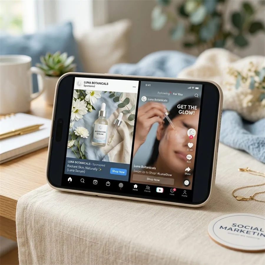
Spend a week looking at performance data inside a brand's Meta Ads Manager and you stop arguing about whether creative matters. You can see, ad by ad, that the difference between a campaign that pays for itself and one that quietly bleeds budget usually comes down to a single image. The audience targeting is roughly the same. The copy is roughly the same. One creative stops the thumb; the others don't. That's the entire game.
The catch — and it's a real one for any small or mid-sized brand — is that you can't tell in advance which image is going to be the one. The teams that get this right don't pick a winner from a meeting room. They test five to ten variants, kill the losers within a few days, and double down on whatever the audience is actually responding to. Traditional product photography makes that kind of testing prohibitively expensive. AI photography is the reason this approach has trickled down from the brands with seven-figure ad budgets to brands shipping their first Shopify catalogue.
Human-led visual production
Want a visual system built around your product?
Share your brand, product references, and launch goals. We will recommend the right engagement model.
What actually counts as good ad creative
There's a temptation, when briefing ad creative for the first time, to ask for "scroll-stopping" images. It's a useful instinct but a vague one. In practice, the images that perform well on paid social tend to share a small set of properties, regardless of category:
- They make the product itself unambiguous within the first half-second. You should be able to identify what's being sold from a thumbnail with the audio off.
- They have a clear hierarchy. One thing for the eye to land on, not three.
- They borrow a visual language the audience already trusts. A skincare ad that looks like a magazine editorial does better than the same ad that looks like a stock-photo collage.
- They look like they belong in the feed. Top-of-feed ads on TikTok that look polished do worse than ones that look incidentally well-shot, because users have learned what an ad looks like and scroll past it.
None of those points are about photography technique specifically. They're about whether the brand has a clear point of view about who's buying and what context they imagine themselves in.
The platform specs, briefly
You don't need to memorise this. Most studios will deliver these by default. But for reference:
Meta (Facebook & Instagram)
- Feed: 1080 × 1080 (square) or 1080 × 1350 (4:5 portrait). 4:5 takes more vertical real estate on mobile and tends to outperform square.
- Stories & Reels: 1080 × 1920 (9:16). Keep your product out of the top and bottom 250 pixels — Meta overlays the username at the top and the CTA at the bottom.
- Text overlays under roughly 20% of the canvas. Meta no longer penalises text-heavy images outright, but they still under-deliver.
TikTok
- Full-screen 9:16 at 1080 × 1920. The platform has its own safe-zone overlays that vary by ad type — your delivery team will know.
- Style note: TikTok's audience is allergic to anything that looks like a magazine ad. AI-generated lifestyle imagery that feels handheld, slightly imperfect, and contextual outperforms the same brand's polished hero shot. This is the one platform where deliberately less-finished imagery wins.
- 1000 × 1500, vertical 2:3. Pinterest is closer to a search engine than a feed; users come looking for ideas, so the image should sell an aesthetic, not just a product.
Five creative angles worth testing first
If I were briefing a brand's first paid-social creative round and we had budget for five or six variants per product, this is where I'd start. None of these are silver bullets — they're starting points to learn what your specific audience responds to.
The lifestyle-in-use shot. The product doing what it does, in a setting the buyer aspires to. A ceramic mug on a quiet kitchen bench at 7am, not floating against a marble cloud. This is your default top-of-funnel creative; if nothing else works, this usually will.
The high-contrast hero. A bold, single-colour background that makes the product pop. Less editorial, more billboard. Works particularly well for products with strong silhouettes — perfume bottles, sneakers, kitchenware.
The detail close-up. The stitch, the seal, the gem cut, the ingredient drop. Sells craftsmanship and material quality. Strongest performer in retargeting, where the audience already knows what the product is and needs a reason to buy this version of it.
The variant grid. Three or four colourways, sizes, or scent variants in a single composition. Tells the audience there's a range, gives them a small dopamine hit of choice, and tends to lift CTR on category-aware audiences.
The contextual scale shot. Product alongside something that gives it scale — a hand holding it, a coffee cup beside it, a doorway behind it. Underused. Almost always lifts conversion because it answers a question the listing photos don't: how big is this thing actually.
Why testing volume is the unlock
I'll give you the operational version of the argument. A brand running paid social with a traditional shoot will, in a given quarter, produce maybe ten to fifteen polished product images. They'll use the best two or three as ad creative, run them until fatigue sets in, then run them some more because the cost of refreshing is too high.
A brand using AI photography for the same period will run six or eight creative tests in the first month alone, kill the underperformers, and have a clear sense of what's working before the quarter is even out. They're not necessarily smarter. They just have a feedback loop that closes weeks faster.
This isn't a hypothetical advantage. It's the entire reason high-performing direct-to-consumer brands look so different from their competitors three months into a campaign — they've been compounding learnings while everyone else has been waiting on the next shoot.
A workflow that doesn't waste your time
The actual cadence I'd recommend for a brand getting started with AI-generated ad creative looks roughly like this. Brief a small batch — five or six images, two or three creative directions per product. Run them through Meta's standard creative testing setup (or whichever platform you're prioritising). Give the algorithm three to five days to find its footing before reading the results. Identify what's working, kill what isn't, brief the next round of variants based on the winners — usually riffing on the same visual idea rather than starting fresh. Repeat.
The mistake to avoid is briefing twenty different ideas at once. You learn less from a wide test than you do from a focused one, and you'll end up with creative fatigue without ever understanding why anything worked. Narrow tests, fast cycles, compound over the quarter.
If you want the production side handled for you, see our social and ad creative service, review the affordable AI product photography page, browse the portfolio, or start with the free sample shot.
Human-led visual production
Ready to build a visual world your brand can own?
Tell us what is launching, where the work will appear, and what the visuals need to achieve.